
Colour in Interior Design remains one of the most personal yet endlessly misunderstood decisions we make when shaping the rooms we inhabit. Long before we consider the arrangement of furniture or the texture of upholstery, our eyes seek out hue and tone to make sense of a space. Walking through a Victorian terrace in London or a stone cottage in the Cotswolds reveals how drastically a room shifts from morning grey to afternoon amber. We often treat shades as prescriptions for happiness or calm, assuming a coat of blue will lower our heart rate or a splash of yellow will guarantee cheerfulness. Yet the reality of living with pigment is far more nuanced, rooted in physical architecture, shifting daylight, and the private stories we carry into our homes.
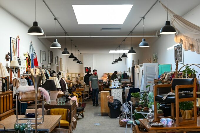
The relationship between hue, mood, and identity resists simple categorization. Professional design guidance from the Royal Institute of British Architects consistently emphasizes that spatial context and volume dictate how a room receives a finish far more than any arbitrary colour theory chart. A deep, saturated charcoal that feels protective and intimate in a small, low-ceilinged library can feel oppressive and cold in a sun-drenched, open-plan extension. We must also consider how we furnish these spaces over time, sometimes balancing new paint choices with secondhand home decor that brings a weathered patina and historical depth to the walls. Colour does not exist in a vacuum; it bounces off timber floorboards, absorbs into wool textiles, and interacts with the specific geographical light of our surroundings.
Room orientation plays a foundational role in how pigments behave throughout the day. North-facing rooms in the British Isles receive a cool, bluish light that can render pale neutrals stark and uninviting, while south-facing spaces wash every surface in a warm, golden glow that softens even the most assertive crimson or olive. Peer-reviewed colour-perception research highlights that human judgment of saturation and temperature shifts dynamically depending on surrounding illuminants and contextual contrast (Elliot & Maier, 2014). This means that a tin of paint selected under the harsh fluorescent glare of a DIY warehouse will transform completely once applied to a living room wall flanked by heavy linen curtains and oak furniture. Acknowledging this variability liberates us from the anxiety of getting a shade right on the first try and invites us to observe how our rooms breathe across the seasons.
The Materiality of Pigment and Personal Association
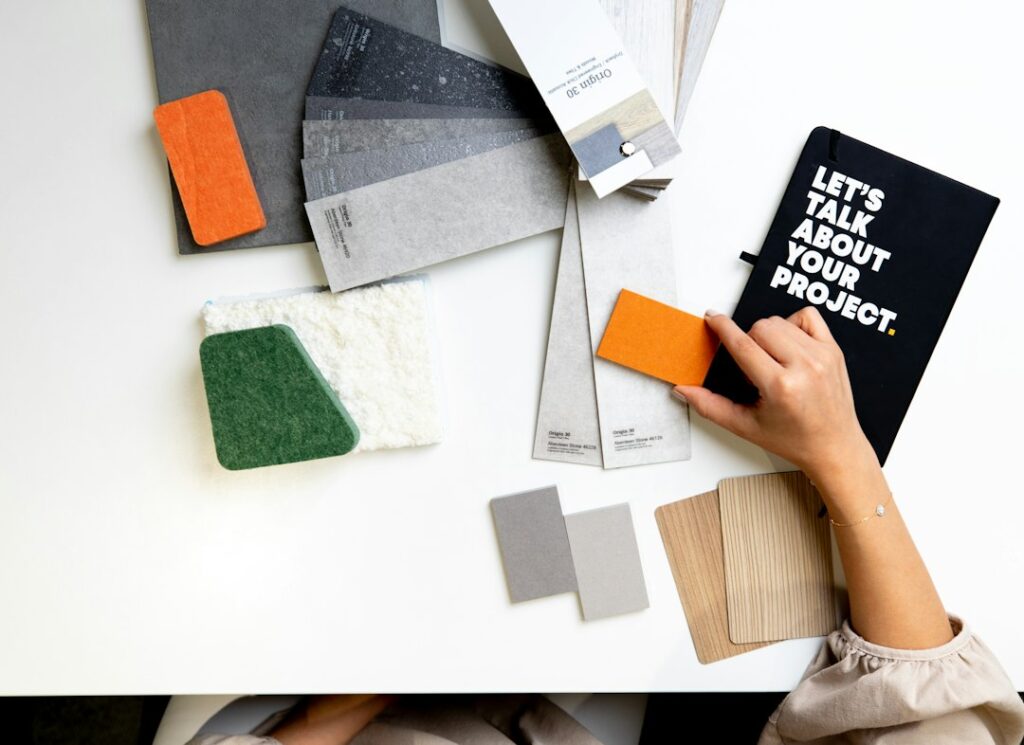
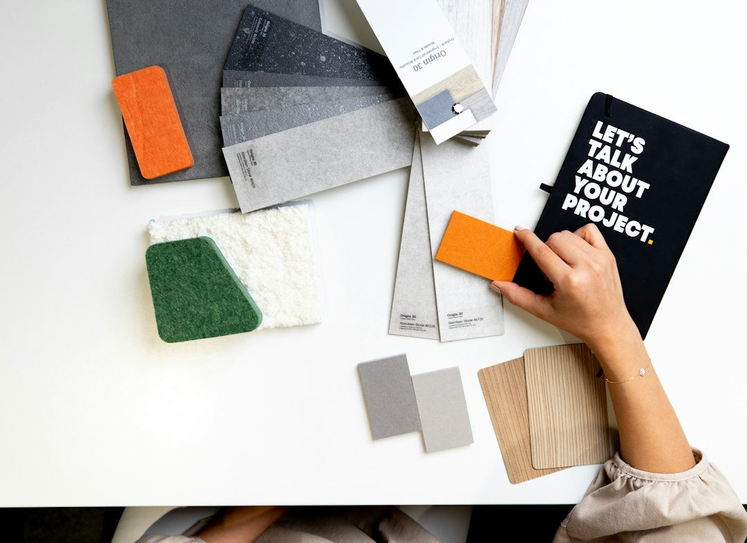
Beyond light and orientation, the physical medium through which we apply colour changes its emotional resonance entirely. Modern formulation standards and independent design assessments indicate that traditional finishes like lime wash, distemper, and matte mineral paints interact with light in ways that plastic-heavy emulsions simply cannot replicate. These traditional materials breathe, absorbing and reflecting ambient light to create a soft, mottled surface that feels alive rather than clinical. When paired with British interiors beyond the trend cycle, these textural pigments create an atmosphere of quiet endurance rather than fleeting novelty. We respond to the tactile weight of the surface just as much as the wavelength of the light bouncing off it.
Personal association remains the most potent filter through which we choose our interior palettes, far outweighing any universal psychological rules dictated by trend forecasters. Someone who grew up near a rugged northern coastline may find profound comfort in muted slates and sea-greens, while another person might gravitate toward terracotta and ochre because they recall the warmth of a childhood kitchen. Empirical studies on affective responses to visual environments confirm that personal history and cultural conditioning heavily mediate our aesthetic preferences (Kwallek et al., 2007). Our homes are autobiographical spaces. When we paint a hallway a dusty rose or a study a deep forest green, we are often trying to recreate a feeling of safety, focus, or expansiveness that we have stored away in our memories.
Ultimately, designing with tone is an exercise in listening to the architecture of the house and the rhythms of our own daily lives. It requires us to look past the prescriptive advice of style magazines and pay attention to how light falls across the floorboards at four o’clock on a rainy Tuesday. Whether we choose to embrace quiet neutrals or rich, enveloping darks, our choices reflect an ongoing negotiation between the shelter we need and the person we are becoming within its walls. For further architectural insights, one can explore design guidelines published by the Royal Institute of British Architects.
References:
Elliot, A. J., & Maier, M. A. (2014). Colour psychology: Effects on perceiving and processing psychological information in normative contexts. Annual Review of Psychology, 65, 95-120.
Kwallek, N., Woodson, H., Lewis, C., & Sales, C. (2007). Impact of interior colour on workers’ task performance, mood, and spatial perceptions. Color Research & Application, 22(5), 352-361.